typeface
US /ˈtaɪpˌfes/
・UK /ˈtaɪpfeɪs/
A1 初級
n.名詞活字書体
動画字幕
ピクサー・ショー:ホッパーズ | 限定短編 +「ホッパーズ」は、ほぼ〇〇についてだった?! (The Pixar Show: HOPPERS | Exclusive Short Film + "Hoppers" was almost about WHAT?!)
- Do you know the name of the Pixar typeface?
ピクサーのフォントの名前を知っていますか?
- Do you know the name of the Pixar typeface?
冗談でしょ?
UXデザインとは何なのか? (What the #$%@ is UX Design?)
- A lot of people feel uncomfortable calling themselves a designer because they're no good at choosing a typeface or a color palette.
をウェブアプリ、モバイルアプリ、デスクトップアプリ、または
- good at choosing a typeface or a colour palette.
書体やカラーパレットを選ぶのが上手い
クリエイティブディレクターの折衷的なアパート | The Stuff That Surrounds | Wallpaper* (Inside a creative director's eclectic apartment | The Stuff That Surrounds | Wallpaper*)
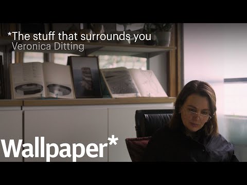
- It's really about communication and how something sits and sings on a page, how a reader might look at it, how the typography make the word more specific, how even the word with the exact chosen typeface changes the whole meaning of it.
それは本当にコミュニケーション、そしてそれがページ上でどのように配置され、響くのか、読者がどのようにそれを見るのか、タイポグラフィが言葉をより具体的にどうするのか、さらには選ばれた書体によって言葉そのものが全体の意味をどう変えるのか、ということなんです。
- it's really about communication and how something sits and sings on a page, how a reader might look at it, how the typography makes the word more specific, how even the word with the exactly chosen typeface changes the whole meaning of it.
私が仕事をするものに対して、とても物理的に触れることが大切なんです。
60's「サイケデリック」や「ヒッピー」の由来は?
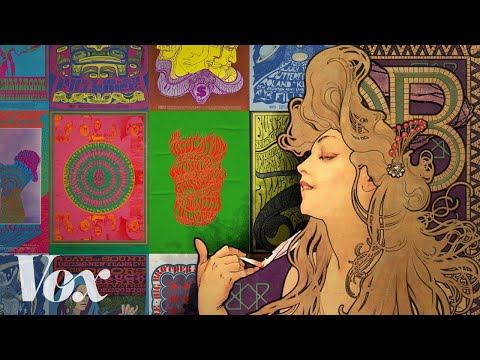
- those venues knew that plain typeface and a grayscale photo just wasn't going to cut it.
"ヒッピー "と呼ばれる新世代のバンドを宣伝するためには、平凡な書体やグレースケールの写真では不十分だったのです。
- In the 60s, artists adapted the bold, dynamic typeface and pushed it even further—softening its lines and obscuring its edges, making it nearly illegible.
60年代、アーティストたちはこの大胆でダイナミックな書体をさらに推し進め、線を細くし、エッジを不明瞭にすることで、ほとんど判読不可能なものにしました。
ネットが真剣になりすぎた10の瞬間 (10 Times the Internet Took Things Way Too Seriously)
- The year prior, Google had a logo change with a new typeface that spurred similar negative reactions.
その前年には、Googleも新しい書体に変更し、同様の否定的な反応を引き起こしました。
Trajan (トラジャン)はどのように映画ポスターの定番フォントになったの?
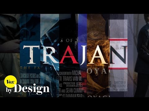
- This typeface — Trajan – is probably one of the most popular movie poster fonts ever.
Trajan (トラジャン)と呼ばれるこのフォントは、おそらく映画広告に使われるフォントとしては最も人気のあるものの1つでしょう。
- In 1989, designer Carol Twombly adapted inscriptions from Roman emperor Trajan's column into a digital typeface.
1989年に、デザイナーのキャロル・トウォンブリ―さんがローマ皇帝トラジャンの神殿の柱に彫り込まれた文字をデジタル文字に取り込みました。
すべてのミームがあのフォントを使う理由
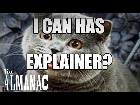
- Every meme is in the same typeface. It's called Impact. But how did that happen?
どのミームも同じ書体です。インパクトと呼ばれています。しかし、どうしてそうなったのでしょうか?
- Impact was later sold to Monotype, another typeface company
Impact は後に別の書体会社である Monotype に売却されました。