Vocabulary
- of the century: 世紀の中で最高の
- in real life: 現実世界で
- all the rage: 大流行のもの
- have to: する必要がある
- for the most part: 大部分は
- rather than: どちらかといえば
- out there: あそこに
- talking about: 〜について話す
- feel like: ~したい気がする
- take on: (新しい性質 : 特徴を)獲得する
- in the future: 将来
- for now: 今のところ
- wake up: 起きる
- perceive: 気づく
- vital: 極めて重要な
- realize: 気づく
- grocery: 食料雑貨類
- intuitive: 直感的な
- specifically: 特に
- develop: 展開する
- scene: 嫌な場面、状況
- navigate: 操縦する
- excessive: 過度の
- abstract: 抜粋
- mimic: ものまね師
- shift: 方向を変える
- rage: 激怒
- flat: アパート
- virtual: 空想の
- expand: 拡大する
- introduce: 始める : 導入する
- drag: 引きずる
- click: 意気投合する
- device: 装置 : デバイス
- press: 圧縮機械 : プレス機
- scroll: スクロールする
- digital: デジタルの
- depth: 深さ
- resemble: 似ている : ~のようである
- feedback: 反応
- combine: 組み合わせる
- fake: 偽の
- medium: 手段 : 媒体
- count: 数える
- lot: 運命
- limit: 限界
- century: 世紀
- technology: 科学技術
- comfortable: (金銭的に)余裕のある
- operate: 操作する
- simple: 易しい
- worldwide: 世界的な : 世界中に広まった : 世界的規模の
- argue: 言い争う
- conserve: 保存する
- sudden: 突然の
- turn: ~歳になる
- change: 着替える
- land: 国土 : 国
- space: (特定の用途の)空き場所 : スペース
- icon: アイコン(コンピューター)
- start: 開始時刻 : 開始場所 : 開始
- overnight: 一夜のうちに
- augment: 増大させる : 増強させる : 効果を高める
- glossy: 光沢のある
- shrunk: 縮んだ
- interface: 接点
- floppy: だらりとした
- notify: 通知する : 告知する
- mid: 中間にある : 真ん中の : 中央の : 中間の
- vector: ベクトル
- logo: (組織を表す)ロゴ(マーク)
- adobe: 日干しレンガ
アプリで完全な体験を
いつでもどこでも学習、文章と使い方を詳しく解説
01:03
She took a brave step forward, leaving behind her comfort zone to chase her dreams.
単語・フレーズ
- brave
adj. 勇気のある
- comfort zone
phr. コンフォートゾーン
文の解説
a brave step は名詞句で、brave は形容詞として名詞 step を修飾し、「勇敢な一歩」を意味します。
forward は副詞として step を修飾し、「前へ」を意味します。
この句全体が目的語となり、took(動詞)の「何を」に答えています——彼女は勇敢な一歩を前へ踏み出した。
アプリで完全な体験を
いつでも単語を調べて、発音・品詞・使い方をマスター
brave
US/brev/
UK/breɪv/
adj.勇敢な
v.t.勇敢に立ち向かう
A2 初級
アプリで完全な体験を
いつでもどこでもスピーキング練習、即時に発音フィードバック
Try this speaking exercise.
この文を真似して練習してみましょう。
80
0
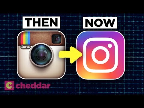
Aniceeee が 2021 年 11 月 27 日 に投稿あの派手な3Dロゴが、なぜあんなにあっという間に消えてしまったのか、不思議に思ったことはありませんか?この動画では、スキューモーフィズムから今日のミニマリストなフラットデザインへと、ロゴデザインがどのように進化してきたのかを、楽しく掘り下げていきます!デザインのトレンドやテクノロジーに関する、視覚的なスタイルが変化していく様子を理解するのに役立つ、素晴らしい語彙を身につけることができますよ。
この動画をアプリで学ぼう!
VoiceTubeアプリ版なら、効果的な学習機能がもっと充実しています!