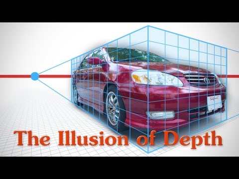
字幕表 動画を再生する
Last time we learned how to use color to create the illusion of depth. Now let's explore various
concepts of shape.
The most familiar way of indicating depth for most of us is perspective. You have converging
diagonal lines, foreshortening of forms, overlapping shapes, and scale. With all of these principles
of perspective we are using shape to create the illusion of depth.
Scale
First, the most basic rule of perspective is that as objects get further from the viewer,
they will appear smaller. So, to show depth it's a good idea to have objects of recognizable
size in both the foreground and background. We know that these two figures should be roughly
the same size, so this smaller one seems further away.
Everybody knows that my biceps are enormously large. A smaller bicep in the same scene will
appear further back.
The objects don't have to be the same, just any objects that the viewer recognizes and
knows its approximate scale. The house on this hill gives us something to go off of
to imagine the size of the hill. When we make the house smaller, now the hill looks like
a mountain, and much further away.
Since distant object are smaller, there's less space to put details. So, don't try to
cram as much details as possible just for the sake of having detail. In fact, removing
information could be better. Putting more detail in the foreground elements and less
detail in the background elements adds to the effect of depth. And consider simplifying
distant shapes. Instead of attempting to include every subtle nuance of the object's contours,
focus on the rhythm of the shape and its role in the picture.
Converging lines, vanishing points
Everybody knows you can�t talk about perspective without mentioning vanishing points. Basically
as objects recede into space they get smaller and smaller and by the time they reach the
horizon they are so far away they've shrunk to mere dots. This is best seen on boxy objects
like walls and furniture and stuff.. The top and bottom of the walls are parallel, but
when perspective is applied, all the lines in the scene that are parallel, will point
to this one vanishing point. This is called one-points perspective. One point perspective
brings the viewer into the scene to look at whatever action is happening near the vanishing
point..
With two point perspective, now you have one side of the box going toward one point, and
the other side towards another point. Instead of bringing the viewer into the scene like
we did with one-point perspective, instead we get an effect of the closest object popping
out towards the viewer.
We can choose to play up or play down this effect with the degree of the angles. For
example with this car, the middle line at the headlight closest to us really jumps forward.
It�s very difficult not to look there. The headlight screams �look at me, I'm in your
face�. So, you would decide if that�s what you want. Is it about the headlight or
the whole car? You can play down this effect by flattening the perspective a bit. Very
different effect and something that many don�t even consider as they start plotting their
perspective. Be careful with this because all these decisions could have an important
role in how the viewer reads your picture.
Lets talk about foreshortening.
Now, foreshortening and converging lines coming to a vanishing point are basically the same
thing.. It�s just things receding back into space and getting smaller. Though with organic
forms you rarely have obvious diagonal lines directing the viewer to a point. Foreshortened,
organic objects, like a leg, appear to be going back because the viewer is familiar
with its extended length and when it's squished down to half the expected size, the viewer's
brain automatically thinks, "well, it must be going away from me..it must be hidden from
sight, behind itself". So in this case it looks like it�s receding because it�s
length is shorter than it should be.
Common mistakes
I see it all the time and I�m a victim myself.. Its a life drawing class, and we�re drawing
a foreshortened leg. Except we don�t draw it foreshortened. We draw it as if it was
fully extended. This is really common, because our brain just doesn�t want to draw it foreshortened.
We�re so used to seeing a leg in its full length, that we just want to draw what we
know. It�s an illusion. But, we�re not the viewers, we�re the artists and we should
be in control of these effects and we should be thinking of how we can use them to our
advantage. Be in control of it instead of fighting it.
Another mistake is we successfully measures the length, but then we just compress the
width to make it resemble more of a leg shape.. Then you have a tiny leg. Seems silly, but
it happens all the time. Stupid brain!
At first, just think of it as an abstract shape. It�s not a leg, its just a shape.
Removing the identity of what you're drawing from your mind should help you stay analytical
Overlapping lines/form
With an organic form like a leg, you also have "overlapping" forms to help show depth.
The leg is made up of many smaller volumes, the muscles and bones, and as these recede,
some will be in front of others. You can show this by overlapping the lines. Femur is in
front of the vastus medialis, vastus medialis is in front of the adductor group, which is
in front of the pelvis.. These overlaps tell the viewers eye that the forms are receding
backward, one after the other..
So, we started with a simple abstract shape for the leg, but that�s flat. After you're
done with the simple shape, go back and establish the overlapping forms.